The Overcoat - Book review

The overcoat By Nikolai Gogol (Text), Sarah Dobai (Art)

Reviewed by Sophy Rickett

Published in Photomonitor

Published in April, 2015, Sarah Dobai’s interpretation of Nikolai Gogol’s The Overcoat depicts only one corporate brand logo, unexpected perhaps in a series of large format works, made predominantly on location, in the commercialised shopping districts of London and Paris.  That corporate brand is lens manufacturer Zeiss, a discreet form of product (context) placement, in the form of a label that corresponds so precisely with the plane of the image that it is not clear if it is a subject in the image or a graphic placed over it.  It is just one of many strategies Dobai uses to explore the themes of Gogol’s narrative, both on its own terms, but also as a text mediated through a photographic understanding of the environment, which relates to surface, to the frame, to composition, to form and to perspectival depth.  

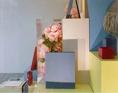
Originally published in 1842, Gogol’s The Overcoat centres on the life and death of Government copyist, Akaky Akakievich, and the acquisition and subsequent theft of his newly tailored overcoat. As a fable, it is a darkly humorous, yet scathing attack on the desperation, hope, pomposity, complacency, money, politics and the greed endemic in a deeply damaged society, where divisions in the social order are the cause of a fundamental breakdown in the political and economic fabric of life. Dobai has described how her project first began to evolve during the 2008 crash in the global financial market – a series of events that seemed to signal the failure of the free market, the collapse of some of the world’s biggest financial institutions, perhaps even capitalism itself. In this new context, Dobai explores the shop display as a seductive façade, where the real subject (of image and scene) is both literally and metaphorically, displaced.  In different ways, each work references the processes of photography itself – the frame within a frame, flattened perspective, reflections of things, refractions of light and differentiated focus all hovering somewhere between the invisible flatness of the plane of the image and the restricted depth of the glass vitrine.

Many of the works explore themes of transience; the precariousness and the fragility of appearance against the brightness and seductiveness of the contemporary urban space. Entitled The Overcoat – Opticians, Mile End, the Zeiss image comes towards the end of the book, the penultimate work in a series of seventeen, and corresponds with Akaky’s emergence as apparition following his death.  Through the loss of his physicality, Akaky has achieved a symbolic presence that enables him to take a critical position and to exact revenge on the prominent personage who had humiliated him when he was alive.  It is one of three works that Dobai reconstructed in her studio and shows a display case loosely lined with folds of red satin to one side of the image, the white plastic structure of a modular shelving unit containing a selection of glasses and lens cleaning fluid to the other.  Centre stage, against the shadows of a grey backdrop, like the apparition in the text, is the reflection of the camera, an image of the mechanism producing an image of itself; the precariousness of the relation between subject and periphery, the processes of seeing and being seen seeing, revealed.

The images themselves do not fit comfortably into any one category; they combine the formal rigour, and slightly stark oddness of Dobai’s unique visual language with something more fluid.  In some of the works, dirt on a window reveals the presence of that same window, the fox suggests both artifice and menace, display plinths are left empty, subjects cropped, an image stands in for an object – all different kinds of displacement, deflection, denial. It’s as if the artist’s ‘rules’ of determinacy are subject to nuanced, yet persistent, revision.  There is a subtle discontinuity between the images: a disjointedness both in relation to subject matter and approach. The restlessness of moving through the urban space, the ‘invisibility’ of the photographer, recalls Walter Benjamin’s seminal Arcades Project, where the arcades of Paris in the 19th century are evoked as bustling, cluttered spaces, where “street and interior merge and historical time is broken up into kaleidoscopic distractions and displays of ephemera”[1]. From the other side of that modernist vision, how might these spaces now be understood, and in the age of one-click purchases and same day deliveries, what is their symbolic function? Are they threatened by the advancement of obsolescence, haunted by the ghosts of their modernist past, “neither present, nor absent, neither dead nor alive[2]”?

Hardback, 88 pages

ISBN 978-1-909829-03-9

Published by Four Corners
Bettina von Zwehl - Exhibition Review

'Ruby with Diamond', 2012, © Bettina von Zwehl. Image courtesy of the artist and The Holburne Museum, Bath.

'Ruby with Diamond', 2012, © Bettina von Zwehl. Image courtesy of the artist and The Holburne Museum, Bath.

Ruby’s Room: Photographic Miniatures by Bettina von Zwehl

Reviewed by Sophy Rickett

Published in Photomonitor

Bettina von Zwehl’s latest project, Ruby’s Room, on show at The Holburne Museum in Bath until the 1st of September, is a newly commissioned body of work made in response to a miniature eye portrait from 1810, currently on display there.  The centre-piece of von Zwehl’s elegant installation is a beautifully illuminated glass cabinet that contains two specially-produced eye portraits, one of her daughter Ruby’s eye, the other of her husband David’s, each set into its own unique piece of jewellery created by jeweller Laura Lee.  As well as these exquisite works, the exhibition consists of just three small photographs; depictions of the artist or her daughter, their miniature presence magnified by crisp pools of spotlight picking them out of the darkened space.

Von Zwehl has described Ruby’s Room as a continuation of her 2011 residency at the Victoria and Albert Museum, where she began to experiment much more than she had previously with different ways of building up a body of work, both technically and also from a methodological point of view.  During this period, some of the strategies and motifs that had previously defined her approach lent her work its strict formal continuity began to give way to something more fluid and spontaneous.  The most obvious observations are technical, such as replacing studio lighting with much softer natural light.  Underlying this immediately noticeable shift however are other more subtle, yet fundamental changes, where von Zwehl seems to be allowing her work to unfold more according to process; at least, in this new way of working, process is emphasised in a way that she might not have considered in her earlier works.  Similarly, in relation to subject matter, she has talked about her growing instinct to work, not with randomly encountered strangers to whom she has no emotional connection, but instead with people close to her; her family, and in another eye portrait project she has been working on in parallel to this one, a small group of close friends. 

At first, the jewellery pieces in Ruby’s Room seem to represent a kind of idealisation of the love object; exquisitely beautiful, diamond encrusted works of art, polished and lovely, gleaming seductively, there to be coveted and admired, but ultimately they are out of reach, absolutely unattainable.  And this is where some of the sheen begins to wear thin, where something a bit darker emerges.  There is something oddly anachronistic about them, as if their very creation is based upon a misapprehension about photography, which holds that an image of an eye could stand in for a real eye.  In this way, photography represents a kind of loss because a photograph can never ‘be’ what it is ‘of’; representation will always, in that respect, fail.  The pieces of jewellery are also, in their own way always going to be threatened by loss.  While they are in the museum, encased in glass, they are ‘safe’, but von Zwehl has spoken about their significance as objects; ‘Holding them is important…’, she says, ‘… owning them even more so’. When they are out of the safety of their museum display cases, they will always be threatened by loss; loss in the literal sense shadowed by something far more symbolic.

A note written by Ruby to her mum, on the scrap of a post-it, left out of the exhibition at Ruby’s request, beautifully conveys some of the tensions that can arise in any type of relationship, whether between artist and sitter, or here, in an extension of that, mother and daughter.  ‘The more I wanted, the more she resisted’ Bettina has said, on remembering back to the negotiations with Ruby when asking her to sit for yet another portrait.  In this way, Ruby’s Room represents a playing out of that relationship, an acknowledgment of the intense focus placed onto the subject of a photograph, exacerbated by the fact that here, the subject is the artist’s own daughter.

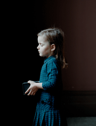
Ruby (with Diamond) shows Ruby, in profile, her face turned towards the light, her eyes closed, slightly tense, her shoulders almost imperceptibly hunched.  The box she has seems a little too big, or maybe too heavy for her hands; holding it has become an effort – you can just feel the strain.  The apparently benign image of a child holding a box gives way for something else, something a bit more unsettling; something maybe not quite right. 

So back to that note, written in haste, and left by Ruby for her mum to find in a little box (that box?) they share, a beautiful and poignant reminder of the deep ambiguities and complexities that run through many familial relationships;  ‘To Mum’ the note reads, ‘I hate you, from Ruby’.

22.05.13 - 01.09.13

Holburne Museum / Bath / England

Gert and Uwe Tobias - Exhibition Review


Reviewed by Sophy Rickett

Published in Photomonitor

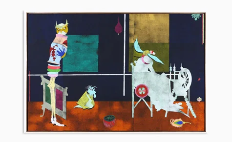
The Tobias brothers have collaborated since 2001, working with a combination of media including woodcut, ceramics, sculpture, painting, drawing and collage (as well as a little photography).  Theirs is a kind of half-world inhabited by an array of strangely truncated, abstract forms, hybrid shapes, patterns, ornamentation, and big, beautiful blocks of heavily printed colour; a world contained by an elaborate system of cross- referencing and of skewed repetition – an archive of the mind that makes complete sense, and also none at all. 

Masks, flowers, leaves, and the thickly woven seat of a chunky wicker chair float in deep blocks of colour.  There’s a miniature arm, and a hand, and a lectern, and against a background of deep, matt black, the beak of a bird emerges from a scruff of chalky mint paint.  An owl with a human hand clutches a vase, a woman chases her head.  It is as if ‘rightness’ and ‘wrongness’ are perfectly conjoined, tied together by ‘a single pictorial idea’ that always, according to the artists, ‘has its roots in drawing’.

So while photography is not a main feature of their work, and they seem only to appropriate existing photographic images from other printed sources rather than make their own, it is still interesting to listen to the way the artists talk about their work and think about it in relation to contemporary debates around photographic representation; ‘The possibility of making a figure life-size …’, says Uwe, when discussing the expansion of scale that their process of building up an image by using segmented printing blocks, permits, ‘allows the [viewer] to enter the pictorial space; it extends the pictorial space out into the gallery.’  

Throughout the installation, the artists’ evocation of pictorial space is fluid, subject to different forces, and at times divergent traditions from 20th century art history, from the repeated motif of the Modernist rectilinear grid, which has a tendency to flatten or ‘democratize’ the pictorial space, to the idea they discuss in the interview reproduced in the catalogue supplement, of the picture as a window into another world; a proscenium. ‘This directness, this immediacy’, says Gert, ‘the potential for the viewer to identify with the figure is much stronger in a larger work.  The scale is preserved…’

Despite this, some of the most intriguing works in the show are smaller, for example, Collaged Books, 2013, a collection of vitrine-based works, that, despite the title, are not books with any sense of completeness.  Their status as ‘book’ is more of a hint – a testing out of ideas in relation to a final formulation.  They represent an exploration of colour, graphics and type, with jauntily cut serrated edges, paper inserts protruding, and other surfaces rendered by hand, set in relation to something much more mechanically orientated.  They are books in the embryonic stage of development, books becoming books, process suspended.

With these, as with many other works in the exhibition, it took a while to take in the work, to process it, before my reaction was articulated through the sound of gentle laughter from the other side of the gallery, another visitor, almost in surprise; ‘I quite like these…’

 – Sophy Rickett

Gerard Byrne - Exhibition Review

© Gerard Byrne'A man and a woman make love', 2012, Multi-channel projection, Variable loop of approx. 19 min. Commissioned by dOCUMENTA (13), Kassel

© Gerard Byrne

'A man and a woman make love', 2012, Multi-channel projection, Variable loop of approx. 19 min. Commissioned by dOCUMENTA (13), Kassel

Gerard Byrne: A state of neutral pleasure

Published in Photomonitor

Reviewed by Sophy Rickett

In Paris, in the 1920s, a group of surrealist artists and writers, convened by André Breton, held the first of a series of twelve round-table discussions on the subject of eroticism.  The discussion is recreated in A Man and A Woman Make Love (2012), a multi-screen installation that provides the entry point into Byrne’s new exhibition Gerard Byrne: A state of neutral pleasure at the Whitechapel Gallery.

In the darkened gallery, five box-like screens are arranged in stacks; thick, solid structures angled upwards, and supported from behind, so that they seem to tumble around the space, tilted precariously.  The picture shifts from screen to screen, one device amongst many employed by the artist to mitigate against any sense of narrative continuity.  Byrne’s reconstruction was filmed for TV in front of a studio audience, who, along with the camera operators, crew and online editor, are shown in the film, alongside the cast of actors as they deliver their lines.  In this way, the final work tells the story of its own creation, sketchy and subjective, and a product of a very specific ontology, combining many different forms.

There’s a lot going on both visually and also with the sound, as if the inevitability of missing something is integral to the work, emphasizing the partiality and uniqueness of any one viewers experience.  The dialogue is a translation from the transcript of the original discussion, published in 1928 in La Révolution surréaliste.  As the male protagonists lounge about, hypothesizing and pontificating, the air of authority and arrogance begins to give way to a sense of anxiety, uncertainty.  The soundtrack is strangely monotonous, insistent and after a while the veneer of televised naturalism breaks down to reveal a sense of awkwardness and claustrophobia; a dark sort of truth.

The idea of ‘disclosure’, in the Brechtian sense, where the manipulative and ‘fictive’ devices of a medium are incorporated as a feature of the work, seems central to many of the pieces in this show. In Why it’s time for Imperial, again (1998-2002), the actor playing Lee Iacocca has an urgency to his delivery; at times it even seems as if he’s forgotten his lines and is being prompted.  He seems stressed, anxious, alienated – and perhaps this in turn alienates the viewer, because it’s difficult to watch; you feel the opposite of empathy.  In the same way, in New Sexual Lifestyles, (2003) another three-channel video shown on monitors, with sound, it’s not clear how much is being deliberately disclosed.  There is something in the delivery of the dialogue itself, the mannerisms of the actors, which seems stilted, overdone.  The naturalism of the original dialogue is re-routed into something altogether more awkward, more self-conscious, more removed.

The photographs in the series, A country road… (2006-ongoing) are on the face of it less open ended, more visually seductive.  Inspired by the stage directions at the beginning of Waiting for Godot, each one shows a tree by a roadside, at dusk, soaked in lurid, coloured light.  Seen individually, each image seems formally complete, but when hung together as series, even here, there is a sense of provisionality, as if the different elements can never combine completely; they can be placed together in the same frame, but there will always be a seam.

At the end of Gallery Nine, Byrne quotes from the journal of the American colonial theologian Jonathan Edwards.

‘If all the world were annihilated, …‘and a new world were freshly created, though it were to exist in … the same manner as this world, it would not be the same.  Therefore, because there is continuity, which is time, it is certain with me that the world exists anew every moment. That the existence of things every moment ceases and is every moment renewed.’

As much as being about deconstruction and reconstruction, and the manipulative contrivances of all these different ontologies, this is a show about time; ellipses in time, lapses in time, and the millions of contingencies that determine each of our own experiences.  It’s about the strange charge of the unexpected, when encountering something the second time round.  And in the spirit of that, I’m going to go back.

17 Jan – 8 March 2013

Galleries 1,8 &  Victor Petitgas Gallery (Gallery 9)

Whitechapel Gallery

Nancy Holt - Exhibition Review

Nancy Holt'California Sun Signs (1'), 1972, Inkjet print on archival rag paper, printed from original 126 format transparencies; printed 2012, 38.1 x 38.1 cm © Nancy Holt, courtesy Haunch of Venison.

Nancy Holt

'California Sun Signs (1'), 1972, Inkjet print on archival rag paper, printed from original 126 format transparencies; printed 2012, 38.1 x 38.1 cm © Nancy Holt, courtesy Haunch of Venison.

Reviewed by Sophy Rickett

Published in Photomonitor

At times with photography, what’s in the picture – the thing in front of the camera, does not constitute the subject of the work.  The ‘real’ subject presents itself less readily, it remains hidden, fundamentally un-viewable, so we are left with in the photograph are traces of that primary subject matter, the presence of something offset by something other, something far less tangible. 

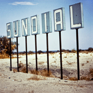
Wistman’s Wood (1969) shows the site of Buried Poem 1 (for Robert Smithson) (1969)– a site specific work where Nancy Holt buried a poem dedicated to Smithson, her partner, in a remote copse of stunted oak trees in the heart of Dartmoor.  Close-up details of thick damp moss, fresh sproutings of baby green foliage and the rough texture of ancient bark are illuminated by warm patches of mottled sunlight.  The photographs allude to the site, they picture it, but they do not complete the circle – they refer to something else, something entirely absent from the frame.  The poem as a subject is present only as a citation, a point of trust between her, and him, and ‘us’.  Likewise, the sun, in California Sun Signs (1972) features indirectly, a linguistic manifestation, a graphic display, an advertising hoarding; in each case absent as a subject, present as a sign, a kind of semiotic landscape both literally and metaphorically. 

The dialogue between Holt’s seminal land art works Sun Tunnels (1973 – 76) and the series of photographs in Sunlight in Sun Tunnels (1976) emphasizes the importance of photographic processes to her practice in general.  Substantially more than visual records of her sculptural work, the photographs offer insights into how our experience of the world is informed by a kind of photographic ontology.  The motif of the frame recurs throughout her practice recalling the act of seeing itself.  But more than that, Holt is interested in how our encounter with the world is formulated by a dialogue between near and far.  Small apertures incised in the thick walls of the four concrete tunnels that make up Sun Tunnels mirror different constellations of stars so that during the course of a day, sharp-edged patches of circular sunlight inch their way across the smooth insides of each gloomy tunnel.  The tunnels are like viewing devices, they are frames, they provide a viewing position, a way in to the spectacle.  The enormous and unimaginable scale produced by the rotation of the earth in relation to the sun is contained inside this small dusty space, and the experience is one of pure intimacy.  The thirty photographs in Sunlight in Sun Tunnels were taken from a fixed camera position every 30 minutes over the course of a day.  They suggest the ebb and flow of cyclical time, time in circles, close up and far away and then close up again, rather than the relentless onward march of chronological time.

The distinction between Holt’s sculptural and photographic works also acts as a starting point from which to consider the series of photographs Light and Shadow Photo-Drawings (1978), a project that started and ended with the processes of photography, dispensing with subject matter altogether.  Here, projected circles of light interact in a kind of choreography of soft geometric forms that Holt referred to later as ‘the concretization of sight’. 

Trail Markers (1969) is a series of twenty photographs that show a landscape as defined through a series of trail markers in the form of orange dots painted onto granite boulders, dry stone walls, and wooden gate posts.  Originally, the trail markers were photographed by the artist in sequence, in the same order they were encountered, but in the installation, that narrative has been disrupted, so it no longer makes sense chronologically.  In a further rejection of the idea that landscape is best viewed from the single fixed position characteristic of much lens-based imagery, the series develops Holt’s understanding of landscape not as a subject in itself, but as a site of experience, a measure of place. 

We connect with the world, she seems to be saying, through our physical connection to the ground.  We walk through, or we stand very still and we witness the incredible effects of the movement of our earth as it spins through space.

08.06.12 - 25.08.12

Haunch of Venison / London / England

John Stezaker - Exhibition Review

 
Image-111.jpg
 

Reviewed by Sophy Rickett

Published in Hotshoe

“The collecting started in 1973” John Stezaker has said, and with it a new preoccupation, one that would persist, going on to form the foundation to his artistic practice right up to the present day.  In this major solo exhibition at the Whitechapel Gallery, the artist presents over ninety works spanning the thirty eight years between then and now. 

Stezaker is known for his collage, a technique that in his hands is so minimal, it can amount to a single cut that slices an image from his collection of studio publicity portraits squarely in two.  This, and the subsequent layering, and aligning, of that fragment of face over another creates a kind of third face, a someone in between.  It sounds innocuous enough, yet the images  weirdly and profoundly unsettle.  They are of impossible creatures, monstrous, grotesque, their features collapsed in on themselves, through some strange twisted origami or otherwise embellished by the crudest means, yet their humanity endures; they retain an aura of dignity, the gentle ring of truth.  In the Mask series, again featuring studio publicity portraits, the ‘host’ image, (the face of the actor,) is blocked by a commercially produced post card depicting a landscape feature such as a waterfall, a grotto or a cave, that seems to knock a hole, bang, in the centre of the face like a punch.

In Tabula Rasa, the artist’s intervention takes the form of an incision; a perfectly formed rectangle cut out of the image, yet at the same time intruding into the image through its consistency with the perspectival plane of the original photograph.  The Lost Tracks collages also play with perspective, this time through emphasizing an artificially constructed vanishing point.  Here, the incision between the two images is difficult to discern because it is ‘hidden’; subsumed into the perspectival geometry of the train tracks that the title of the series refers to.

Stezaker’s work has not developed chronologically; instead he works sequentially, often returning to a series twenty or thirty years after its initial inception, making it at times difficult to tell an early work from a later one. His concerns and his technique shift between the series; he always works with found images, often using some form of collage, yet that term can seem too bland, inadequate as a way of evoking the psychological strangeness that lies at the heart of what he does.

The earliest of the works, The End, (1975) is a small rectangular fragment of a post card showing Big Ben at twilight against a dramatically illuminated sky.  This small but significant piece marks Stezaker’s first tentative experiments in working with his ever expanding archive of found photographs, an archive that has intrigued, inspired, and absorbed him ever since.  His later works also consist of found imagery from the archive (which he estimates has come to contain around a million photographs and prints), and although his process has been refined, the work continues to revolve around an absolute fascination with what he describes as a image which is already there, ‘for how’, he asks, ‘can you improve upon that?’

The 3rd Person Archive is an ongoing series of image fragments cut from an ancient photographic atlas of world geography, and later from Victorian travel illustrations.  Each tiny image, printed in the catalogue at actual size, shows an anonymous figure in an unidentified place.  Captured by accident, and purely incidental to the purpose of the original photograph these figures seem to haunt the spaces through which they move.  Some are so grainy, so pale they are almost transparent, their presence so fleeting as to only just register in the image at all.  And while the film star portraits have on the face of it a whole other energy, that is, the weight of the Hollywood studio publicity system; the lighting, the makeup, the whole context of the ‘silver screen’, there is also something very frail about the personas they present, something of the fragile transience that characterizes those distant lonely figures in The 3rd Person Archive.

Stezaker celebrates the forgotten, the inconsequential, the anonymous, the accidental; the Dark Star collages came about when, having cut out the portrait of an actress from the page of a magazine full such portraits, the artist noticed the effect this had on the portrait of the actress on the other side of the page, who had now become caught up in a strange sort of standoff with a black silhouette.  I ask what he does with his off cuts – maybe it’s a relief, I suggest, when you get to throw something in the bin.  “Rarely happens”, I am told.  “There are no such thing; off cuts often turn out to be the most interesting bit”.

John Stezaker

29.01.11 – 18.03.11 

Whitechapel Gallery

-

18.1.11 – 11.09.11 

Mudam, Luxmbourg